Responsive web design, or RWD, is really about making your website flexible and user-friendly across various devices. The core principles include using flexible grids that adjust layouts based on screen size, scaling images so they fit nicely within these grids, and applying CSS media queries that dictate how content should appear on different screens. This method not only simplifies maintenance by needing just one design but also enhances the user experience significantly. When designing, remember to think about screen sizes and prioritize essential content for smaller displays. Also, don’t forget performance optimization to ensure quick loading times for all users. abun.com
Definition of Responsive Web Design
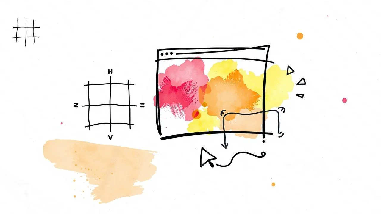
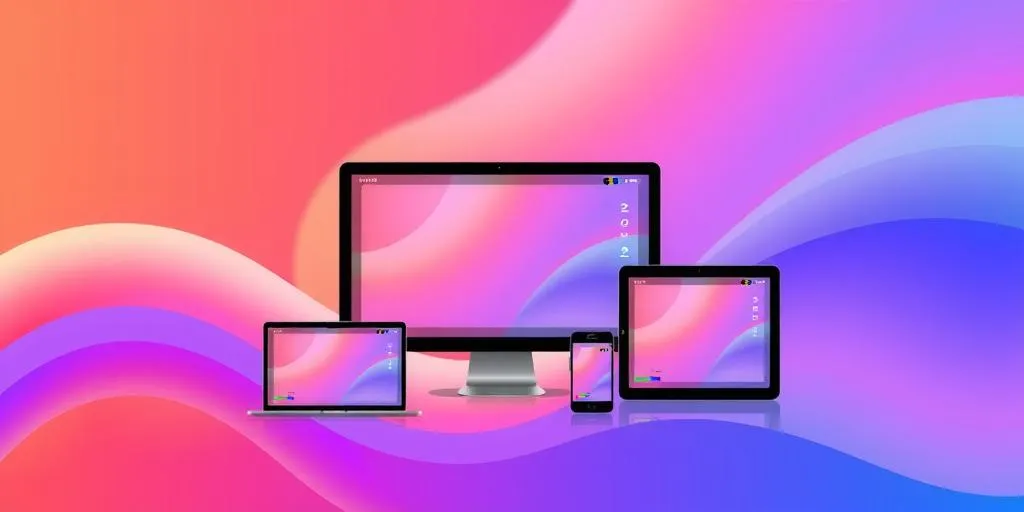 Responsive Web Design (RWD) is a method that enables web pages to adjust seamlessly to different devices and screen sizes. Rather than creating separate versions of a site for desktops, tablets, and smartphones, RWD allows a single design to adapt based on the user’s environment. This is achieved through several key components. Flexible grids use relative units like percentages for layout, which allows for fluid designs that respond to varying screen widths. Flexible images scale within these grids, ensuring that they maintain their proportions and do not overflow their containers. Additionally, CSS media queries play a crucial role by applying different styles based on the device characteristics, such as screen size and orientation. For instance, a media query might change the layout of a site when viewed on a mobile phone versus a desktop, ensuring optimal usability and appearance.
Core Principles of Responsive Web Design
 Responsive Web Design (RWD) focuses on creating layouts that adapt seamlessly to different devices and screen sizes. One core principle is the use of flexible grids, which employ relative units like percentages instead of fixed units such as pixels. This allows the layout to adjust fluidly based on the viewport size. Another principle is the use of flexible images. By applying CSS properties like
 max-width: 100%;, images can scale appropriately within their containers without overflowing, ensuring they fit well across all devices.
CSS media queries are also essential in RWD. They let designers apply different styles based on device characteristics, such as screen size or orientation. For example, using @media only screen and (max-width: 600px) allows specific styling for mobile devices, making it easier to cater to various user experiences.
These principles work together to create a single design that works well on any device, improving user experience while simplifying maintenance and updates. By considering different screen sizes and prioritizing essential content for smaller screens, designers can ensure that their websites are not only functional but also visually appealing across all platforms.
| Core Principles | Description |
|---|---|
| Flexible Grids | Layouts that use relative units to create fluid designs. |
| Flexible Images | Images that scale within the confines of a flexible grid. |
| CSS Media Queries | Techniques that allow different styles based on device characteristics. |
Advantages of Responsive Web Design
Responsive Web Design (RWD) offers a range of benefits that make it an essential approach for modern web development. One of the primary advantages is the ability to maintain a single design across all devices. This eliminates the need for multiple versions of a site, simplifying updates and maintenance. For instance, instead of creating separate sites for desktop and mobile, designers can focus on one cohesive experience that adapts to different screen sizes.
Another significant benefit is the improved user experience. With RWD, users enjoy a seamless navigation experience, whether they’re using a smartphone, tablet, or desktop. This consistency helps keep visitors engaged and reduces bounce rates. For example, a user accessing a website on their phone can expect the same functionalities and ease of use as they would on a larger screen.
Additionally, RWD is cost-effective. By streamlining design and development processes, businesses can save time and resources. There’s only one site to manage, which means less time spent on troubleshooting across multiple versions. This efficiency can lead to quicker turnaround times for updates and new features.
Finally, RWD enhances SEO efforts. Search engines favor mobile-friendly sites, which means that implementing responsive design can improve a site’s visibility in search results. By ensuring that all users have a consistent experience, businesses can also boost their brand reputation and trustworthiness.
Design Considerations for Responsive Design
When creating responsive designs, it’s crucial to account for the diverse range of devices users may employ. Different screen sizes and orientations, such as portrait and landscape modes, can significantly alter how content is presented. For instance, a website that looks great on a laptop may appear cluttered on a smartphone. Prioritizing content is also vital; not all information needs to be visible on smaller screens. Focus on essential elements first, ensuring that users can easily access the most important details without unnecessary scrolling or zooming.
Another consideration is the interaction method. With the rise of touchscreens, design elements must cater to both touch and traditional mouse-based navigation. Buttons should be large enough for finger taps, while hover effects may not always translate to touch devices. This means that designers should think about how users interact with their designs across various platforms, ensuring a smooth experience regardless of how they access the site. Ultimately, these design considerations set the foundation for an effective and user-friendly responsive web experience.
Technical Implementation Techniques
To effectively create responsive frontend designs, several technical implementation techniques are essential. First, employing fluid layouts is crucial. This often involves using responsive frameworks like Bootstrap or CSS grid systems, which facilitate flexible adjustments based on the viewport size. For instance, a grid layout can adapt from a multi-column design on desktop screens to a single-column layout on mobile devices, ensuring content remains accessible and visually appealing.
Next, CSS media queries play a vital role in this process. By applying different styles for various screen sizes, designers can ensure that their layouts are tailored to the specific characteristics of the devices. For example, using a media query like @media only screen and (max-width: 600px) can trigger a change in styles when the screen size is 600 pixels or less, allowing for a more user-friendly experience on smaller screens.
Responsive images are another key aspect to consider. Techniques such as the srcset attribute in HTML allow the browser to select the appropriate image size based on the device’s capabilities, which helps in loading faster and improving performance. Additionally, using CSS properties like max-width: 100%; ensures images stay contained within their parent elements.
Finally, implementing a viewport meta tag, such as <meta name="viewport" content="width=device-width, initial-scale=1.0">, is crucial for proper scaling on mobile devices. This tag helps ensure that your website is displayed correctly across various devices, maintaining a consistent and engaging user experience.
Best Practices for Responsive Design
To create effective responsive designs, start with the viewport meta tag. This tag sets the visible area of a web page on mobile devices, allowing for proper scaling. For example, using <meta name="viewport" content="width=device-width, initial-scale=1.0"> ensures your site adapts to different screen sizes.
Next, focus on performance optimization. Images can significantly slow down load times, especially on mobile. Use compressed images and consider lazy loading techniques to improve speed. This way, users experience faster loading times, enhancing their overall experience.
Regular testing across various devices is crucial. Emulators can help, but nothing beats real-world testing. Ensure your design looks good and functions well on different devices and screen sizes. This practice helps catch any issues early, providing insights that can refine the user experience.
Lastly, keep your designs simple and intuitive. Prioritize essential content for smaller screens, ensuring users can access vital information quickly without feeling overwhelmed. A clean layout with clear navigation aids usability, which is key in responsive design.
- Use a fluid grid layout to ensure content adapts to various screen sizes.
- Implement flexible images that resize within their containing elements.
- Start with mobile-first design principles to prioritize essential features.
- Utilize media queries to apply different styles for different device widths.
- Test responsiveness across a range of devices and browsers.
- Optimize assets for faster loading times on mobile networks.
- Ensure touch targets are appropriately sized for easy navigation on touch devices.
Future Trends in Responsive Design
As we move forward, responsive design will continue to evolve alongside technology. New devices with varied screen sizes and capabilities will emerge, requiring designers to stay flexible and adaptive. CSS Grid and Flexbox are gaining traction, offering more robust layout options that allow for creative and responsive designs. For instance, using CSS Grid can help in creating complex layouts that adjust seamlessly on different screens, while Flexbox simplifies alignment and distribution of space among items in a container.
Additionally, understanding user behavior is crucial. With more users accessing websites via mobile devices, designers must prioritize mobile-first approaches. This means focusing on the mobile experience first and then expanding to larger screens, ensuring that essential content is easily accessible. Furthermore, as voice interfaces and augmented reality become more prevalent, designers will need to consider how these technologies interact with responsive design.
Ultimately, keeping an eye on emerging trends and technologies will allow designers to create visually appealing and functional experiences that meet the evolving needs of users.
Resources for Further Learning on Responsive Design
To deepen your understanding of responsive design, several resources can provide valuable insights and practical guidance. Books like “Flexible Web Design: Creating Liquid and Elastic Layouts with CSS” by Zoe Mickley Gillenwater offer comprehensive strategies for implementing responsive techniques. You can also explore online courses focused on responsive design, available on platforms like Smashing Magazine, which often feature hands-on workshops and tutorials. These resources not only cover the basics but also delve into advanced topics, helping you stay current with the latest trends and technologies in web design.
Graphic Design: Blending Art and Technology in Design
Graphic design is at the intersection of creativity and technology, and this blend is crucial in responsive frontend design. When creating a website, designers must think not just about aesthetics but also about functionality across various devices. This means using design elements that look good on a smartphone as well as on a desktop. For example, a simple layout might work wonders on a mobile screen, but it needs to adapt its structure when displayed on larger devices.
Artistic choices such as color schemes, typography, and imagery should also be flexible and responsive. A vibrant image might capture attention on a large screen but could overwhelm a mobile user. Therefore, designers often employ techniques like adaptive image sizes or specific CSS rules to ensure the visuals are engaging yet appropriate for each context.
Moreover, the technology behind responsive design—such as CSS Grid and Flexbox—allows for a more fluid arrangement of elements, giving designers more freedom to express their creativity while ensuring usability. This synergy of art and technology creates a holistic user experience, where every interaction feels seamless, regardless of the device. Ultimately, the goal is to craft designs that are not only visually appealing but also functional and user-friendly.
Frequently Asked Questions
1. What is a responsive frontend design?
A responsive frontend design is a way to make websites look good on any device, whether it’s a phone, tablet, or computer. It adjusts automatically to fit different screen sizes.
2. Why is responsive design important for websites?
Responsive design is important because it provides a better user experience. Users can easily navigate and view your site without having to zoom in or scroll sideways, which keeps them engaged.
3. How can I test if my design is responsive?
You can test your design by resizing your browser window or using tools like Chrome’s Developer Tools, which lets you preview how your site looks on different devices.
4. What tools can I use to create responsive designs?
There are several tools you can use, like Bootstrap and Flexbox, which help you create layouts that adapt to different screen sizes easily.
5. What are some common mistakes to avoid in responsive design?
Common mistakes include using fixed widths, ignoring mobile users, and not testing on various devices. It’s essential to focus on flexibility and usability across all platforms.
TL;DR Responsive Web Design (RWD) adapts to various devices, enhancing user experience across all screen sizes. Key principles include flexible grids, images, and CSS media queries. Benefits include a single design for all devices, improved usability, and cost efficiency. Considerations involve prioritizing content, accommodating different interactions, and ensuring performance. Implement fluid layouts, media queries, and responsive images. Best practices include using the viewport meta tag and testing on multiple devices. Future trends will evolve with technology, embracing new layout methods and user behavior shifts.