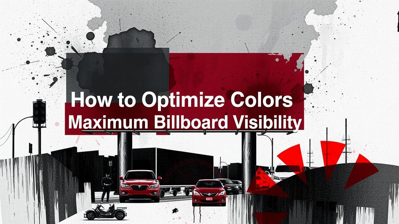
Table of Contents
- Understand Color Psychology in Billboards
- Use High Contrast for Clear Visibility
- Stick to a Limited Color Palette
- Factor in Color Blindness
- Manage Brightness and Saturation
- Craft Simple Bold Messaging
- Test Colors and Gather Feedback
- Adapt to Environmental Factors
- Leverage White Space Effectively
- Balance Digital and Static Billboard Designs
- Frequently Asked Questions
11.1. How does color choice affect billboard visibility?
11.2. What makes high-contrast colors stand out for billboards?
11.3. How can different color combinations impact viewer attention?
11.4. How does lighting interact with billboard colors for better visibility?
11.5. Why is it important to test your color schemes for billboards?
Understanding how colors work is essential when designing billboards to grab attention. Colors, driven by psychology, can evoke emotions and influence viewer behavior. Bold high contrast elements like black on yellow or white on blue ensure clarity from afar. Using 2-3 primary colors and integrating brand hues can reduce clutter. Consider color blindness by supplementing colors with patterns to further differentiate key elements. Bright and saturated tones capture interest, yet natural lighting and environmental factors may alter appearances. Testing designs and adapting messages ensure legibility and effectiveness. Overall, combining simplicity with deliberate color choices guarantees your billboard remains eye-catching. For best results.
Understand Color Psychology in Billboards
Understanding how colors influence emotions is key for any effective billboard design. Colors can trigger certain feelings and behaviors; for instance, red might spark a sense of urgency, while blue communicates reliability. Choosing the right colors that resonate with your audience and message is essential. Consider testing different shades under various lighting conditions to see what stands out best. Keep your color choices simple and direct, ensuring high contrast and readability. For example, a bold red call-to-action on a neutral background can draw attention without overwhelming the viewer.
Use High Contrast for Clear Visibility
High contrast is key in making your billboard easy to read and visually appealing. Using combinations like black text on a yellow background or white text on a blue background helps the message stand out even from a distance. This approach minimizes eye strain and ensures that the information is quickly accessible to drivers and pedestrians alike. In real-world scenarios, testing different contrast pairings under various lighting conditions can pinpoint the most effective design, ensuring your billboard remains compelling throughout the day.
| Contrast Pair | Example | Benefit |
|---|---|---|
| Black text on Yellow background | Effective high contrast combination | Ensures text stands out |
| White text on Blue background | Effective high contrast combination | Promotes legibility |
Stick to a Limited Color Palette
Using a minimal color scheme helps maintain focus and clarity. Stick to 2-3 primary colors to avoid visual clutter and ensure your message remains the main attraction. A restrained palette not only keeps the design clean but also reinforces brand identity when your core colors are consistently used. For example, if your brand leans towards blue and white, integrating these into your billboard design creates a strong, memorable visual impact without overwhelming the viewer. In billboard advertising, simple is often better; limiting colors allows key elements to stand out against a clear background, making your message easy to read from a distance.
- Select 2-3 dominant colors that capture your brand’s essence.
- Ensure high contrast between the background and any text.
- Use complementary accent colors to enhance visual appeal.
- Avoid oversaturating by limiting the number of hues.
- Maintain consistency with your overall digital and print advertising.
- Verify that chosen colors work well in various lighting environments.
- Reassess and tweak colors to keep the messaging clear and impactful.
Factor in Color Blindness
Billboards should be designed so that everyone can easily see their message. Around 8% of men and 0.5% of women experience color blindness, which can make it hard to distinguish between colors like red and green. Adding patterns or textures to color schemes is an effective way to ensure that key elements stand out. For example, using a striped or dotted pattern on a red background can help the information stand out for those who might not see the color difference as clearly. This approach leads to billboards that are accessible and effective for a broader audience.
Manage Brightness and Saturation
Using bright, saturated colors can instantly draw attention to your billboard. They help important features stand out, ensuring your message is noticed even from a distance. However, it’s key to balance vibrancy so that the colors remain comfortable to the eye. For example, a bright red tone might captivate an audience during the day, but under evening lighting conditions, it may need a slight adjustment to avoid overwhelming viewers. Testing different brightness and saturation levels in real-world scenarios guarantees that your billboard remains effective at any time.
Craft Simple Bold Messaging
Keep your billboard message simple and bold. Use large, easy-to-read fonts that make your message stand out, even from a distance. Stick to just a few strong words that quickly communicate your idea. For example, white text on a dark background or black text on a bright backdrop can create a high-contrast look that grabs attention immediately. By using minimal text and clear colors, you ensure your billboard communicates effectively, even in challenging lighting conditions.
Test Colors and Gather Feedback
Testing different color options is essential for creating an eye-catching billboard. Using A/B testing helps you compare variations, such as red text on a yellow background versus white text on blue, to see which design draws attention. Gather feedback from your target audience through surveys or focus groups to understand how the colors perform in real-world conditions. This approach not only helps in selecting vibrant and clear color combinations but also ensures the billboard remains accessible and effective for everyone.
Adapt to Environmental Factors
Billboard design doesn’t happen in a vacuum. When setting up your display, consider the impact of natural light, weather, and surrounding colors. For example, a design that looks vivid on a cloudy day might appear washed out in bright sunlight. Adjust saturation and brightness to match various conditions. Testing your billboard in different environments can help fine-tune color choices. This small tweak ensures your message stands out, whether it’s blazing midday sun or a dusky evening backdrop.
Leverage White Space Effectively
White space is not just empty space; it helps guide the viewer’s eye and make the message stand out. A billboard with clear gaps around text or images allows each element to breathe, improving legibility and ensuring the key points are not lost in clutter. For example, a design that clusters important elements and surrounds them with ample white space instantly grabs attention, making the billboard easier to scan and understand from afar. This simple yet powerful technique balances the layout and reinforces the visual impact of the design by allowing colors and bold fonts to do the talking.
Balance Digital and Static Billboard Designs
Digital billboards offer the chance to use dynamic elements like subtle animations or color transitions. These techniques can refresh a message and capture attention in different lighting conditions. In contrast, static billboards rely on strong, consistent color contrasts and clear images to communicate instantly. Using a limited color palette and testing designs in varied environments helps ensure both digital and static formats stand out. Tailoring your approach to each medium keeps your messaging clear and effective.
Frequently Asked Questions
1. How does color choice affect billboard visibility?
Using the right colors can help your message stand out. Bright or contrasting colors often make signs more readable from a distance, drawing attention even in busy areas.
2. What makes high-contrast colors stand out for billboards?
High-contrast colors, like black on white or blue on yellow, create a clear separation. This clarity helps people read the text quickly, which is key when they are moving or distracted.
3. How can different color combinations impact viewer attention?
Different color combinations can influence mood and focus. Pairing complementary colors can enhance visibility, while clashing shades might confuse the viewer or make the message hard to read.
4. How does lighting interact with billboard colors for better visibility?
Lighting plays a big role in how colors are seen. Good lighting can enhance the vibrance of colors or, in poor lighting, wash them out, so it is important to consider both natural and artificial light when designing billboards.
5. Why is it important to test your color schemes for billboards?
Testing color schemes helps you understand how your design performs in real-world conditions. It ensures that text and visuals remain sharp and effective during different times of the day and in various weather conditions.
TL;DR This guide covers how to make billboards that catch eyes: use color psychology, high contrast, and a streamlined palette, while accounting for color blindness. It emphasizes bright, saturated colors without overwhelming viewers, and highlights the need for simple, bold messaging, testing, and adapting designs to different environments. Digital designs can tweak colors dynamically, whereas static ones rely on strong contrasts and effective white space.